Custom (S)CSS
Matching the portal to your brand is vital for a seamless experience for your users.
You can determine several colors in Settings > Branding by default, but what if you want more customization?
This is super easy and hyper-flexible in ProductLift using custom (S)CSS.
Start custom designing
-
Go to Settings > Branding
-
Ensure to enable Custom styling
-
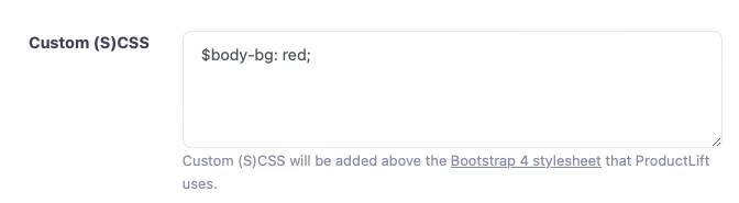
Scroll down to the Custom (S)CSS box
Here you can add CSS or change elements.
Variables
You can design your portal by overriding the default variables.
An example:
Here is a list of the most regularly used variables. You just set them in the (S)CSS box to override them with a new value.
ProductLift uses the Bootstrap 4 library, so you can override any of their variables.
This is our default setting:
$primary: #0071e3 !default;
$font-family-base: "Poppins",-apple-system,Helvetica,sans-serif !default;

// Menubar
$navbar-background-color: #ffffff !default;
$navbar-text-color: #495057 !default;

// Tabs
$navbar-brand-color: #3f4254 !default;
$navbar-tabs-color: #3f4254 !default;
$navbar-tabs-bg: #ffffff !default;

// Content
$body-bg: #f9f9f9 !default;
$body-color: #212529 !default;

// Cards
$card-bg: #ffffff !default;
$card-color: #3f4254 !default;

$secondary: #75ACC2 !default;
$green: #399c7e !default;
$red: #f44336 !default;
$warning: #b68b46 !default;
$info: #90CAF9 !default;
$font-size-base: 0.9rem !default;
$input-border-color: #e2e5ec !default;

$navbar-light-color: $navbar-text-color !default;
$navbar-light-active-color: $navbar-text-highlight-color !default;
$navbar-light-hover-color: $navbar-text-highlight-color !default;
$navbar-padding-y: 1.2rem !default;

$dropdown-link-hover-bg: darken($navbar-background-color, 10%) !default;
$dropdown-link-hover-color: $primary !default;
$dropdown-item-padding-y: 0.7rem !default;
$dropdown-link-color: $navbar-text-color !default;
$dropdown-bg: $navbar-background-color !default;
$dropdown-color: $navbar-text-color !default;

$text-on-white: #3f4254 !default;
$table-accent-bg: darken($card-bg, 2%) !default;

$modal-content-color: $card-color;
$modal-content-bg: $card-bg;
$modal-header-border-color: $card-bg;

$nav-tabs-link-active-color:        $card-bg !default;
$nav-tabs-link-active-bg:           $card-color !default;
$nav-tabs-link-active-border-color: $nav-tabs-link-active-bg !default;

$badge-font-size: 90% !default;
$badge-font-weight: 400 !default;
$badge-pill-border-radius: 0.5rem !default;
$popover-font-size: $font-size-base !default; /*Regular size for popover*/
$popover-header-padding-y: 1.3rem !default; // body is based on header
$popover-header-padding-x: 2rem !default;
$popover-max-width: 350px !default;
$btn-border-radius: 0.25rem !default;
$btn-border-radius-lg: $btn-border-radius !default;
$btn-border-radius-sm: $btn-border-radius !default;

$small-font-size: 90% !default;
$text-muted: lighten($card-color, 30%) !default;
$alert-border-width: 0 !default;
$input-placeholder-color: #BBBBBB !default;
$table-border-color: darken($card-bg, 10%) !default;
$table-color: $card-color !default;
$table-head-color: $card-color !default;

$padding-inside-container-cards: 1.5rem !default;

$card-border-radius: 0.5rem !default;
$card-border-width: 1px !default;
$card-border-color: #e4e7eb !default;

$list-group-color: $body-color;
$list-group-bg: $body-bg;

$breadcrumb-padding-x: 0;
$breadcrumb-bg: none;

$h1-font-size:                $font-size-base * 1.5 !default;
$h2-font-size:                $font-size-base * 1.4 !default;
$h3-font-size:                $font-size-base * 1.3 !default;
$h4-font-size:                $font-size-base * 1.2 !default;
$h5-font-size:                $font-size-base * 1.10 !default;
$h6-font-size:                $font-size-base !default;

$grid-breakpoints: (
        xs: 0,
        sm: 576px,
        md: 768px,
        lg: 992px,
        xl: 1200px
) !default;

$container-max-widths: ( /* Always make the page as wide as possible, must be in ascending order */
        sm: 1200px,
        md: 1201px,
        lg: 1202px,
        xl: 1203px,
) !default; Stripe Climate member
 from Utrecht