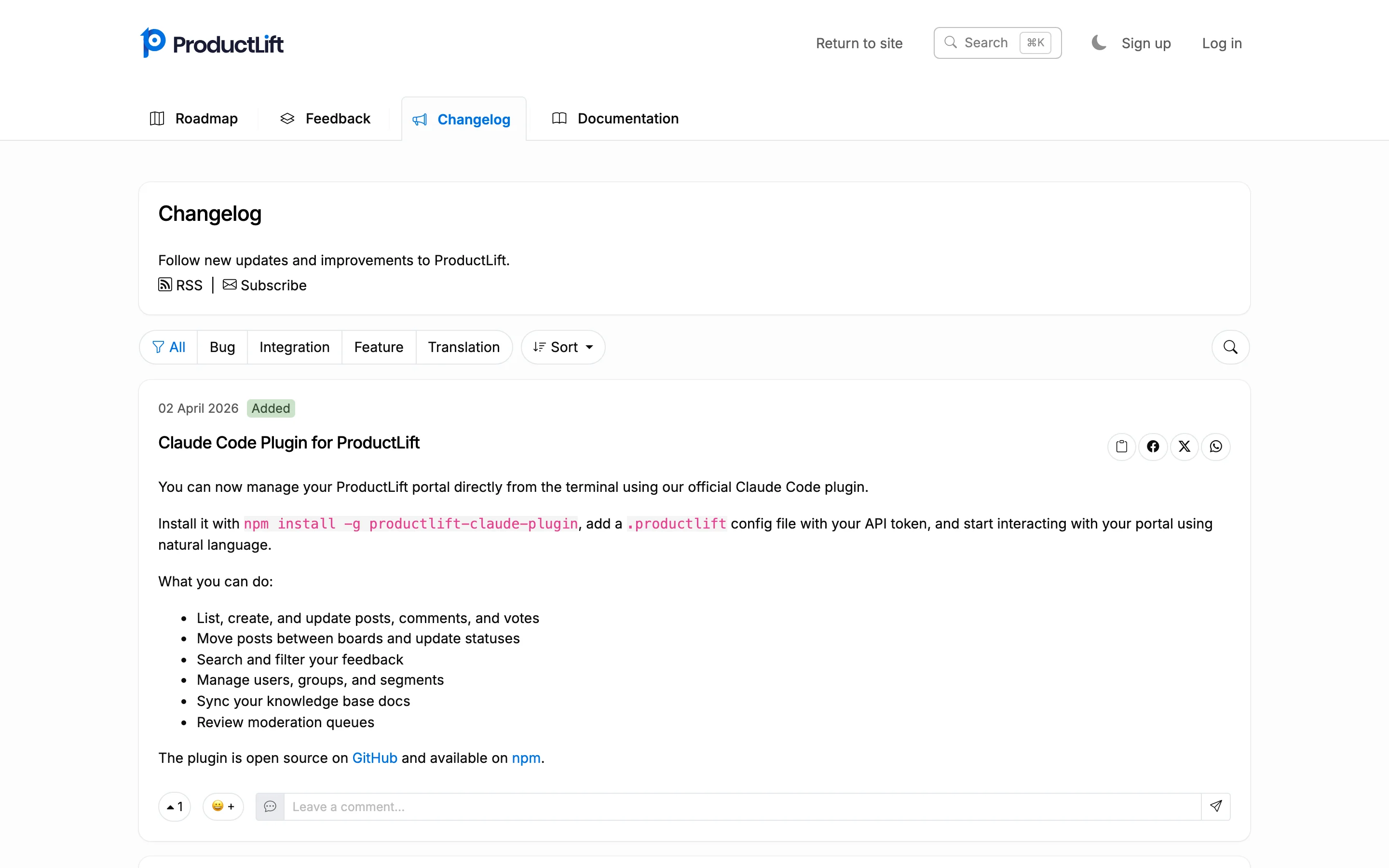
Most SaaS changelogs are a graveyard of bullet points nobody reads. A few companies have turned theirs into a genuine product marketing asset. We analyzed 15 changelogs from well-known SaaS companies to find what separates the ones people actually read from the ones they ignore.
Before diving into examples, here are the five qualities that separate great changelogs from forgettable ones:
With that framework in mind, let's look at the examples.
These changelogs are concise, clean, and scannable. They respect the reader's time and rely on clear writing rather than flashy visuals.
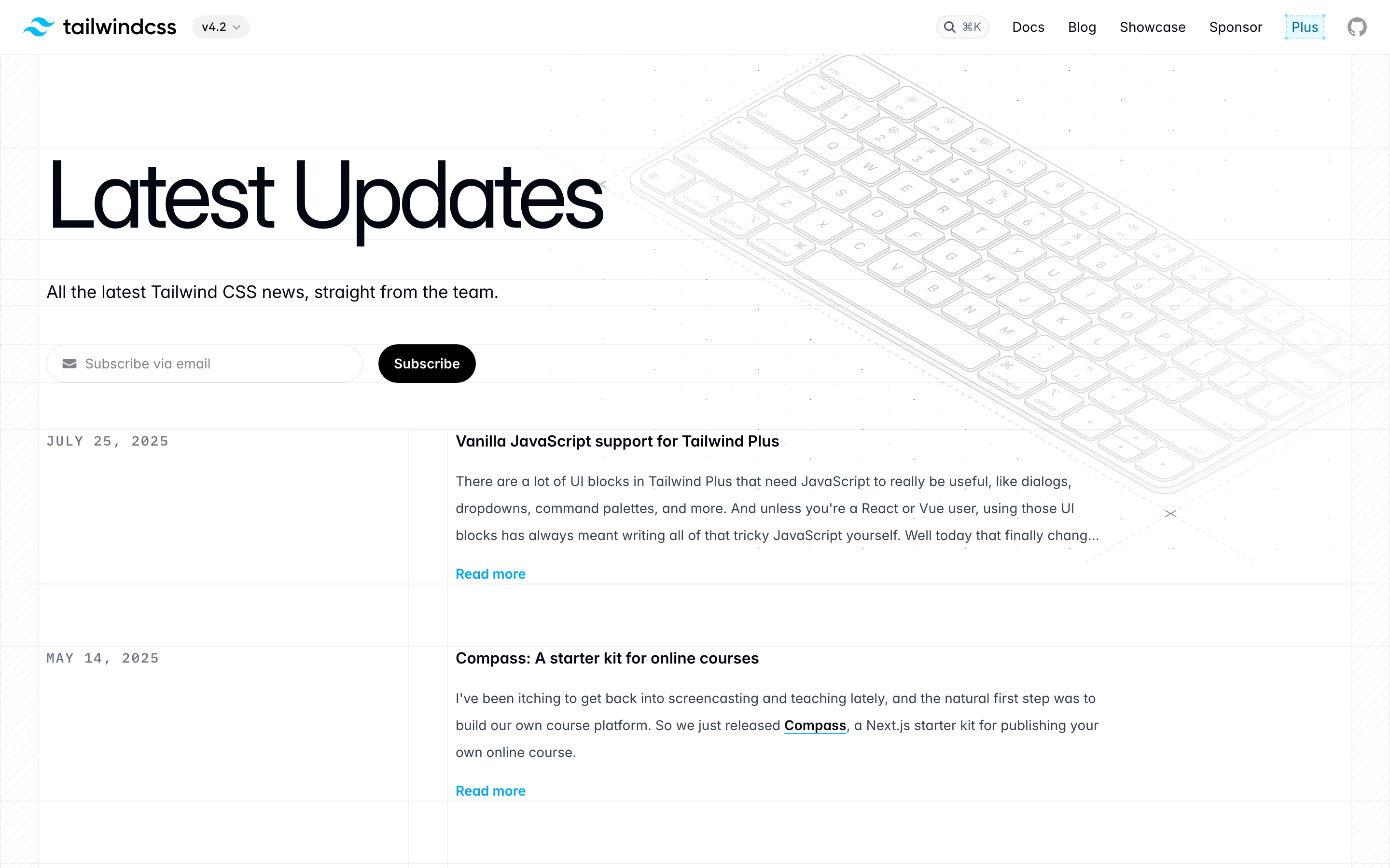
Format: Timeline with categorized labels
Cadence: Weekly
Linear's changelog is one of the most admired in SaaS. Each entry has a short, punchy headline followed by 2-3 sentences of explanation. Labels (Feature, Improvement, Fix) make scanning instant. Every entry links to relevant documentation, and the writing never wastes a word.
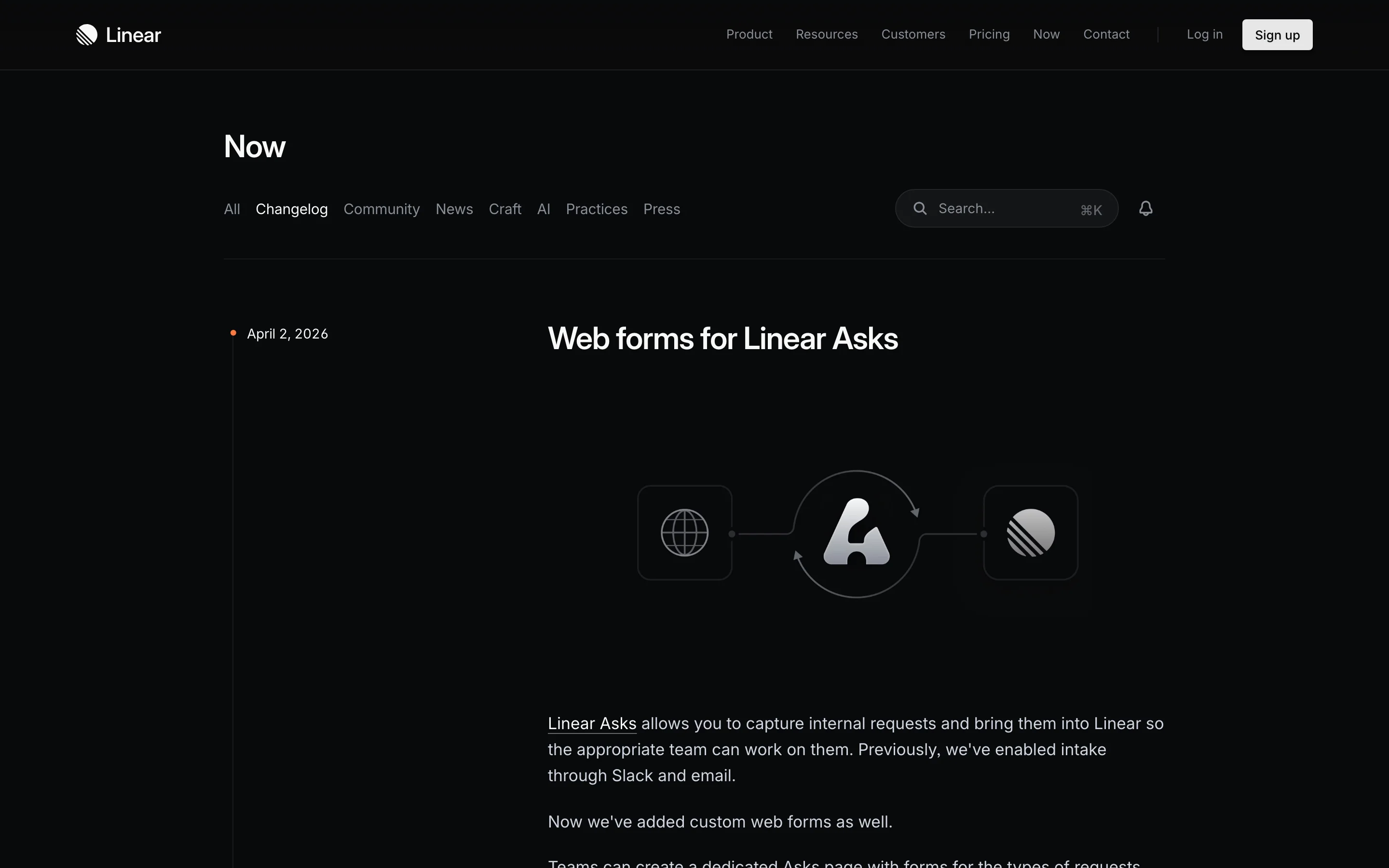
What makes it work is discipline. Linear resists the urge to over-explain. A well-written sentence does more work than a paragraph of filler, and their team clearly understands that.
Format: Simple reverse-chronological list
Cadence: As shipped
Plausible keeps a simple changelog on their website. No fancy UI, no design flourishes. Each entry is a short paragraph with a link to GitHub for technical details. It works because the writing is clear, the updates are meaningful, and the format aligns with their brand: privacy-focused, no-nonsense, transparent.
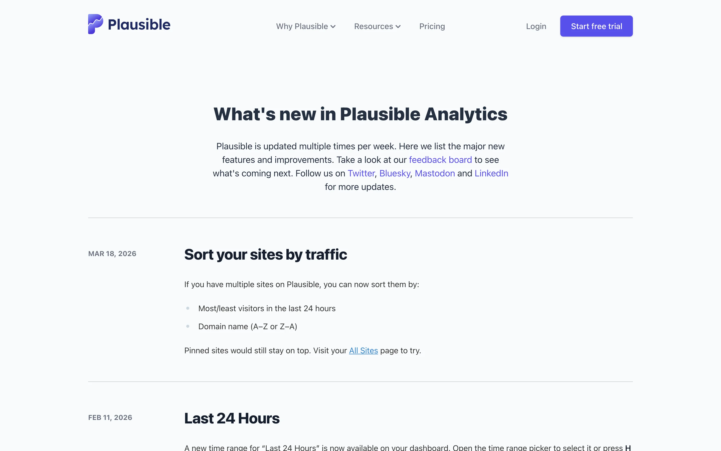
What makes it work is authenticity. Their changelog reads like a developer talking to other developers, because that's exactly what it is.
Format: Blog-style posts with detailed technical writeups
Cadence: Per release
Tailwind publishes updates through their blog, where each release gets a thorough writeup covering new utilities, configuration changes, and the reasoning behind design decisions. Posts include code examples, migration snippets, and links to the relevant documentation. The writing is technical but accessible, explaining not just what changed but why.
What makes it work is the depth of explanation. For a utility CSS framework used by millions of developers, understanding the "why" behind changes matters as much as the "what." Tailwind's posts give developers the context they need to adopt new features confidently.
Format: Clean timeline with product screenshots
Cadence: Weekly
Resend, the developer email platform, publishes a beautifully designed changelog that mixes brevity with visuals. Each entry has a headline, 1-2 sentences, and a product screenshot. The design is minimal but polished, reflecting their brand's attention to craft.
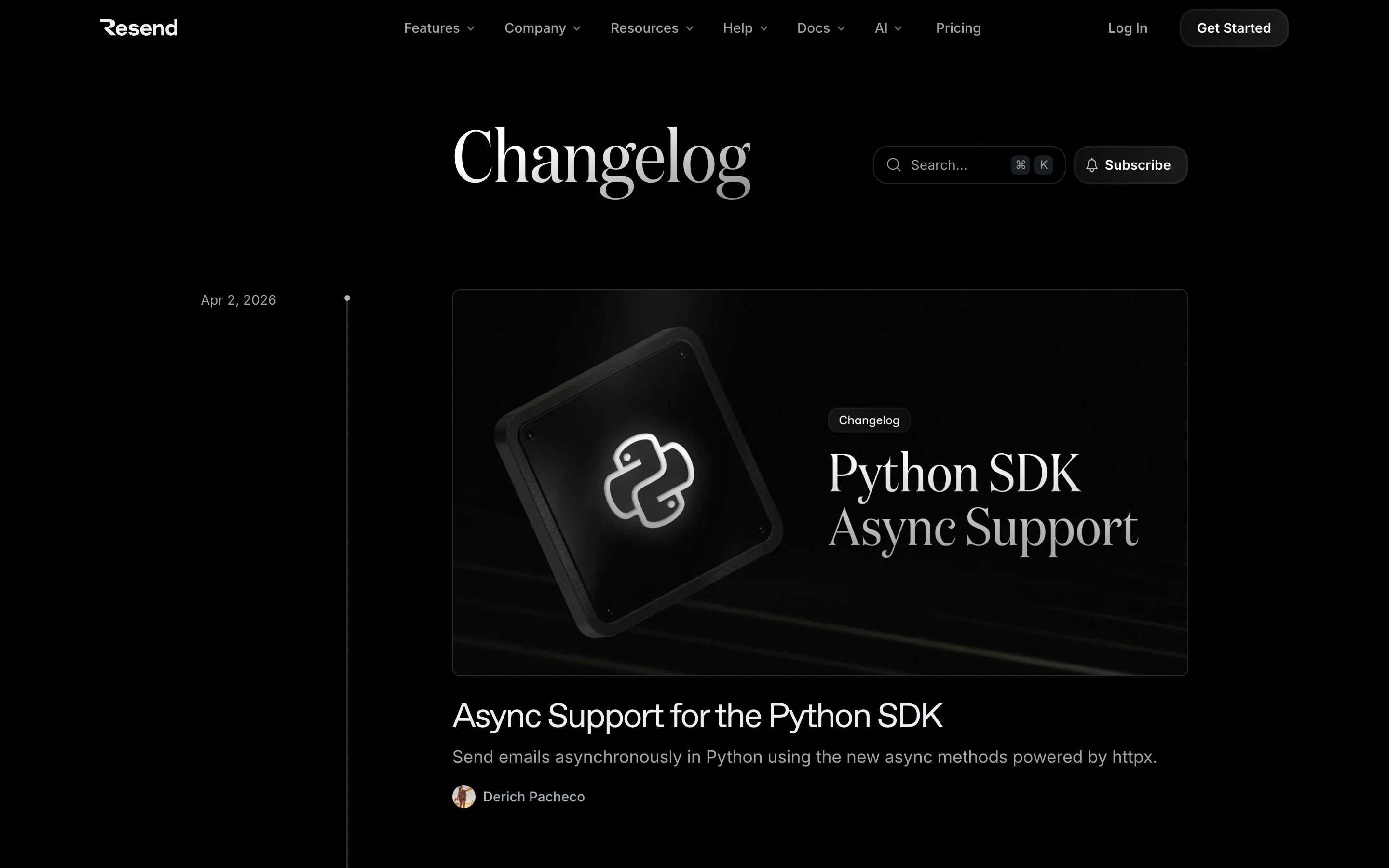
What makes it work is visual consistency. Every entry looks like it belongs to the same family, creating a professional impression that builds trust.
Key takeaway: Minimalist changelogs work when the writing is strong. You don't need a custom-designed page to be effective, but you do need clear, specific headlines and consistent formatting.
These changelogs lean heavily on imagery to communicate changes. They work especially well for products with a strong visual UI.
Format: Blog-style narrative with embedded media
Cadence: Monthly major updates, weekly smaller ones
Notion publishes a "What's New" page that feels more like a blog than a changelog. Each major update gets a dedicated section with large screenshots, embedded videos, and detailed explanations. Minor updates are batched into shorter lists below the main feature spotlight.
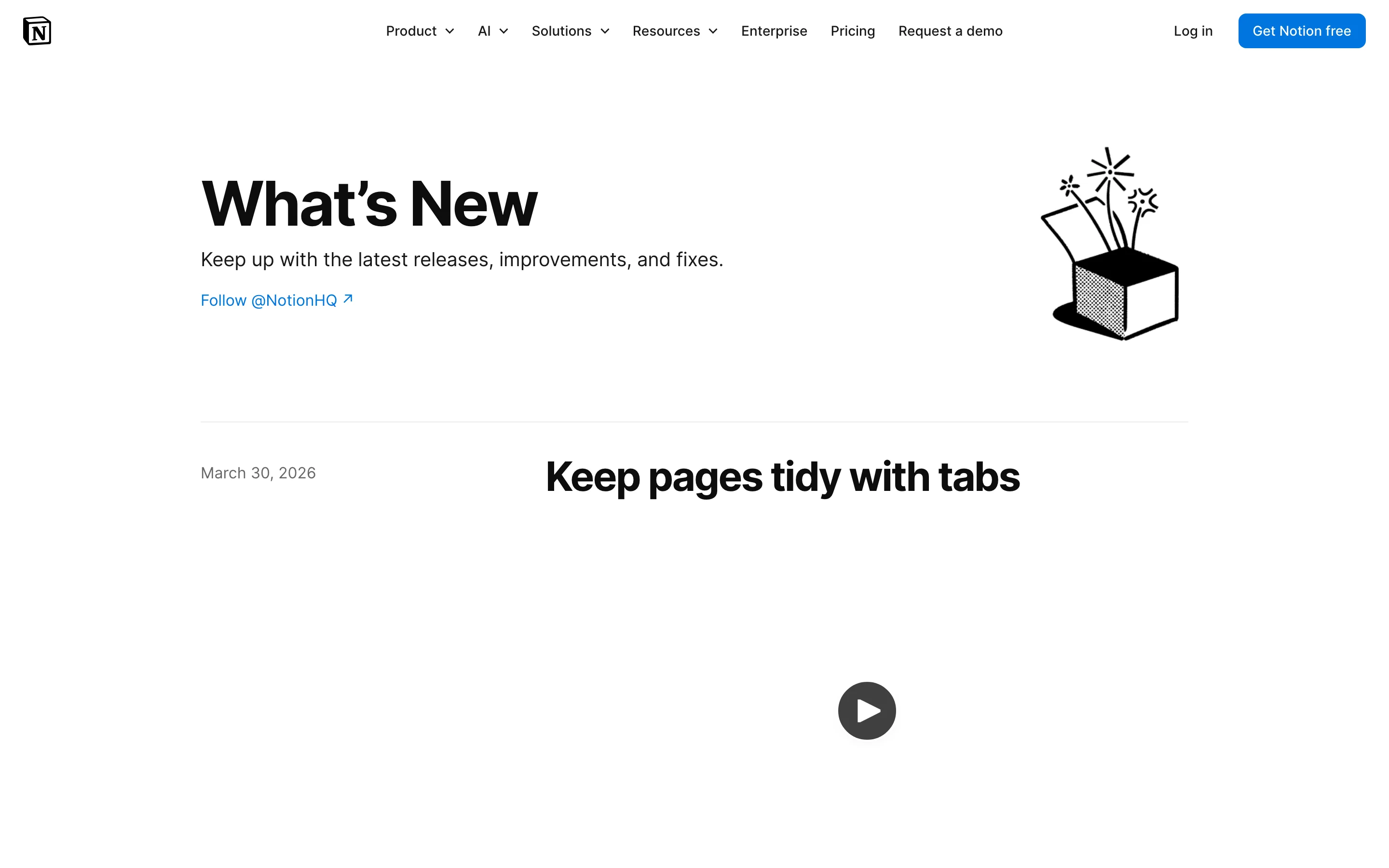
What makes it work is the hierarchy. Major features get the full treatment (video, screenshots, narrative). Minor improvements get a sentence. This tells readers where to focus.
Format: Full blog posts with animated demos
Cadence: Per major release, plus ongoing updates
Figma treats each significant update as a mini-launch. Major releases get full blog posts with embedded demos, animations, and use-case examples. They show the feature in context, solving a real design workflow problem, rather than just announcing it exists.
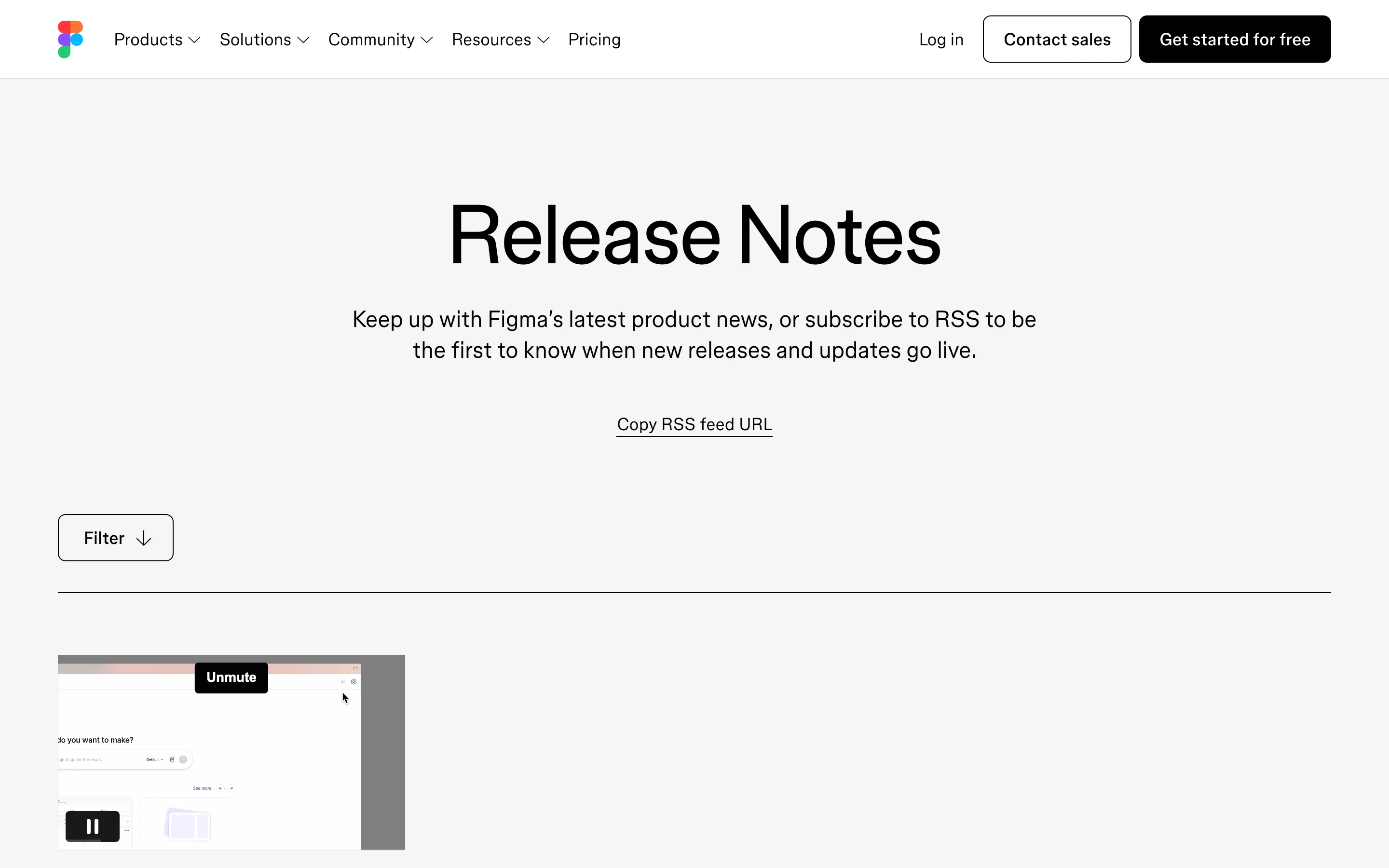
What makes it work is the demo quality. Figma's animated product demos are so polished that they double as marketing material. Designers share them because they're genuinely impressive.
Format: Visual timeline with rich media cards
Cadence: Per feature release
Framer's updates page is a showcase of design craft. Each entry features a large visual card with a bold title, and the dark theme gives the page a premium, editorial feel. Updates range from major feature launches to subtle interaction improvements, and each one gets visual treatment that matches the product's design-forward identity.
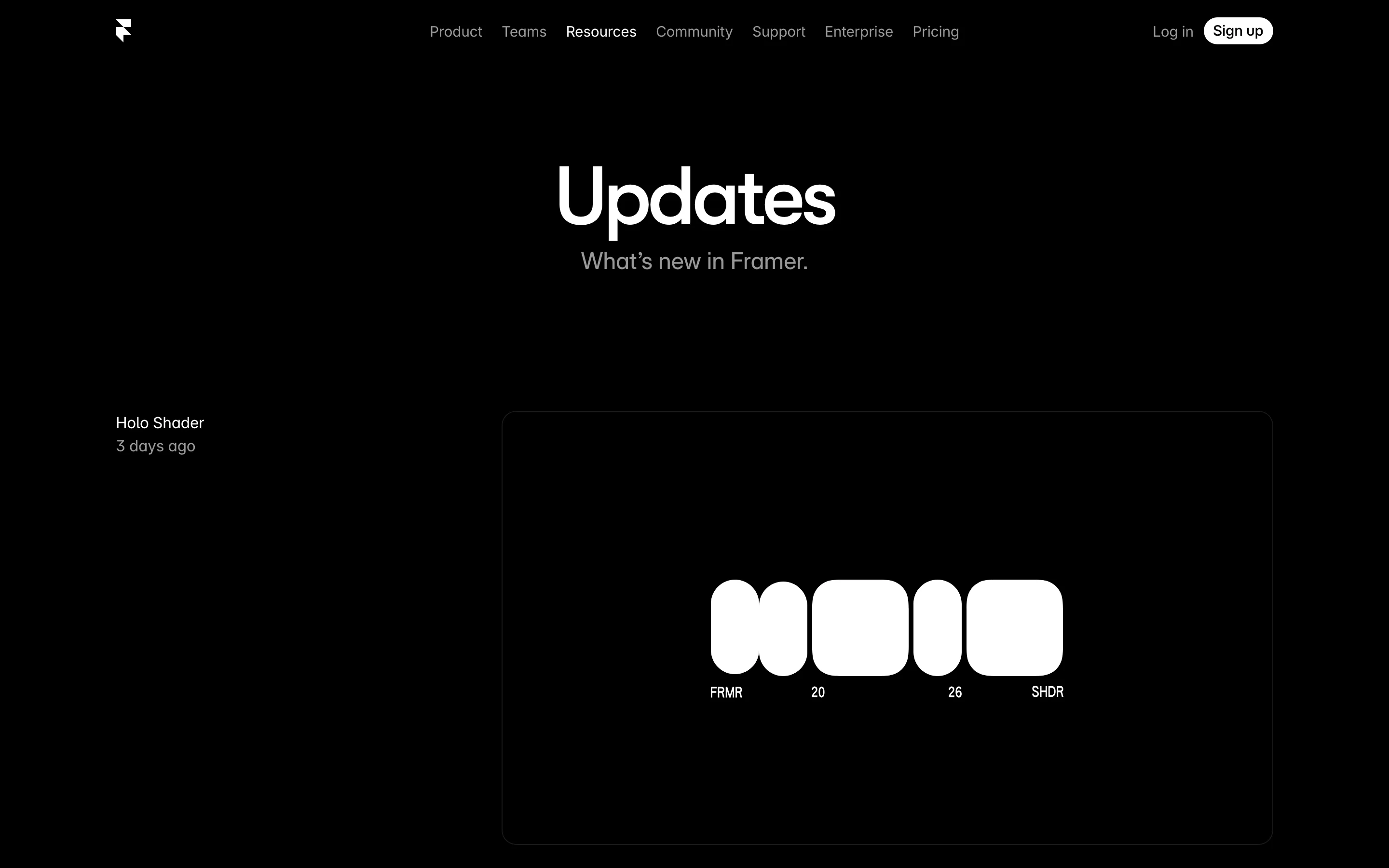
What makes it work is brand consistency. Framer is a design tool, and their changelog looks like it was designed by their own users. Every entry reinforces the product's positioning as a tool for people who care about visual quality.
Try it yourself: ProductLift's changelog supports screenshots, GIFs, and embedded media on every entry, plus emoji reactions so you can see which updates resonate with your users. Start your free trial. No credit card required.
These changelogs target a technical audience. They prioritize precision, versioning, and migration details.
Format: Categorized by product area with version numbers
Cadence: Continuous
Stripe maintains one of the most thorough changelogs in the API world. Every API change is documented with the exact date, affected endpoints, and migration instructions. Changes are separated by product area (Payments, Billing, Connect, Terminal). Breaking changes get prominent callouts with migration guides linked directly.
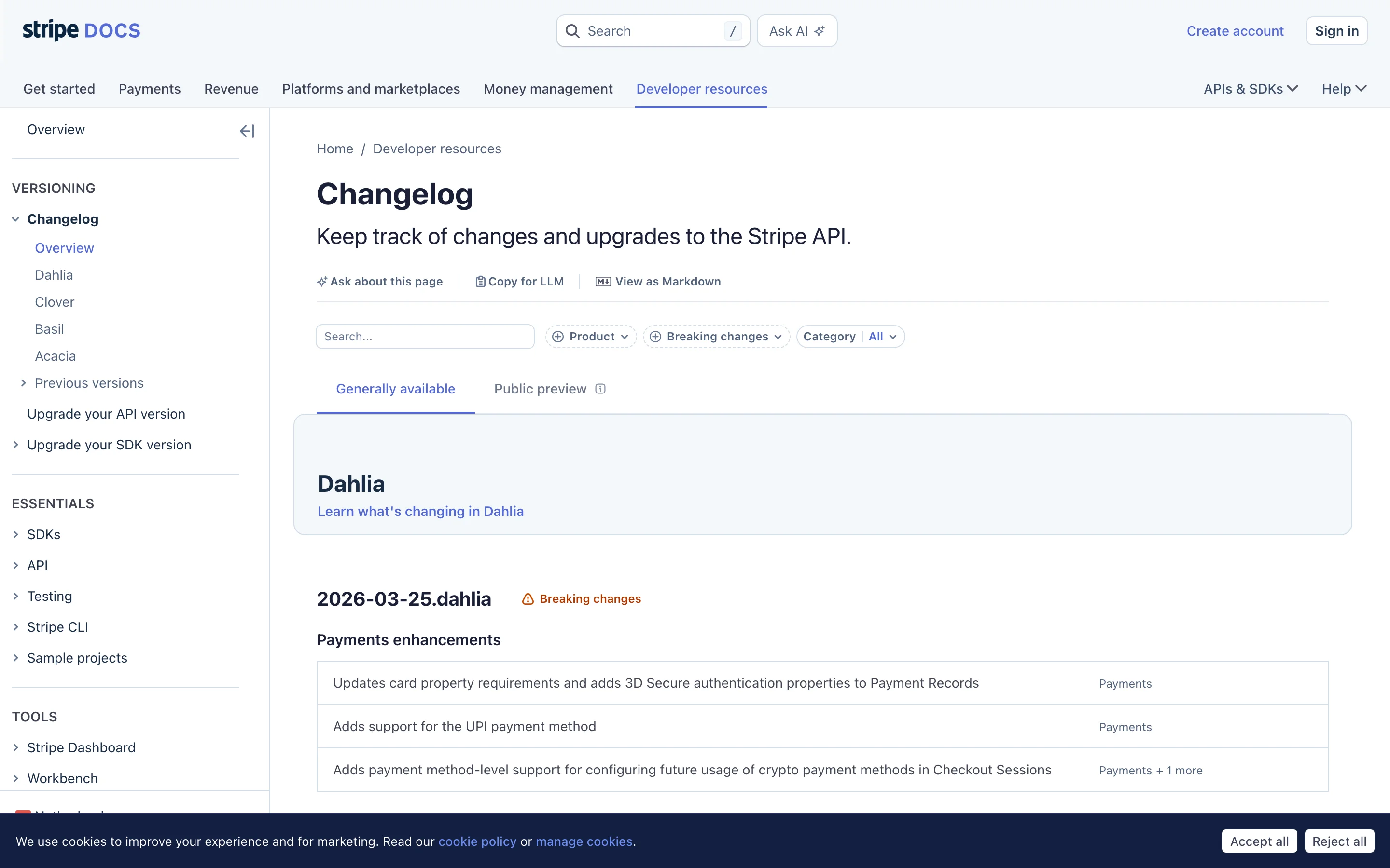
What makes it work is precision. Stripe's developer audience needs to know exactly what changed, what broke, and how to migrate. Vague descriptions would erode trust. Their changelog delivers the specifics.
Format: Tagged and filterable by product area
Cadence: Multiple times per week
GitHub publishes a changelog blog covering updates across the entire platform. Each entry is tagged by product area (Actions, Codespaces, Security, Copilot) and categorized by type. An RSS feed lets developers subscribe to areas they care about.
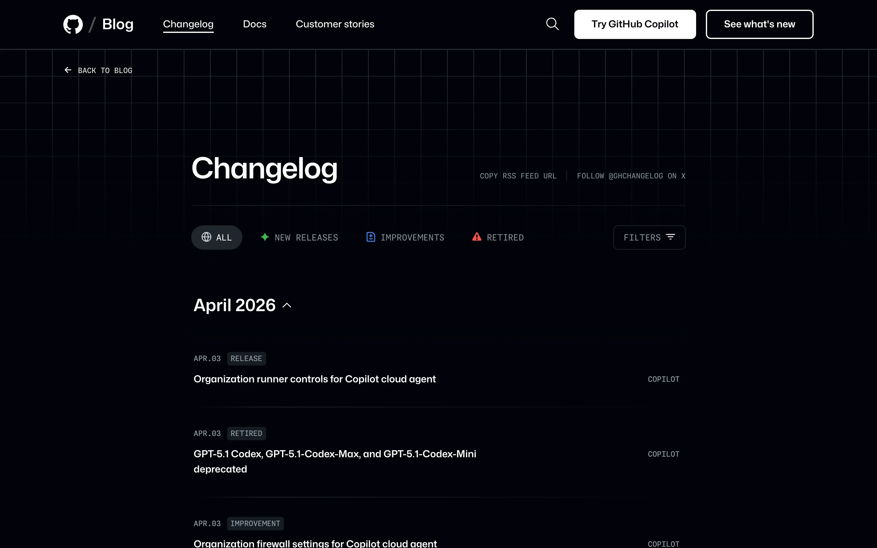
What makes it work is filtering. GitHub is a massive platform with dozens of product areas. Tags and filters let each developer see only the changes relevant to them. No one needs to wade through 50 entries to find the 3 that matter.
Format: Minimal design with code blocks and performance benchmarks
Cadence: Weekly
Vercel's changelog is beautifully designed and technically precise. Each entry includes a clear title, date, and a well-structured description. Code blocks appear where relevant. Performance improvements include before/after benchmarks. The page loads fast (naturally, given the product).
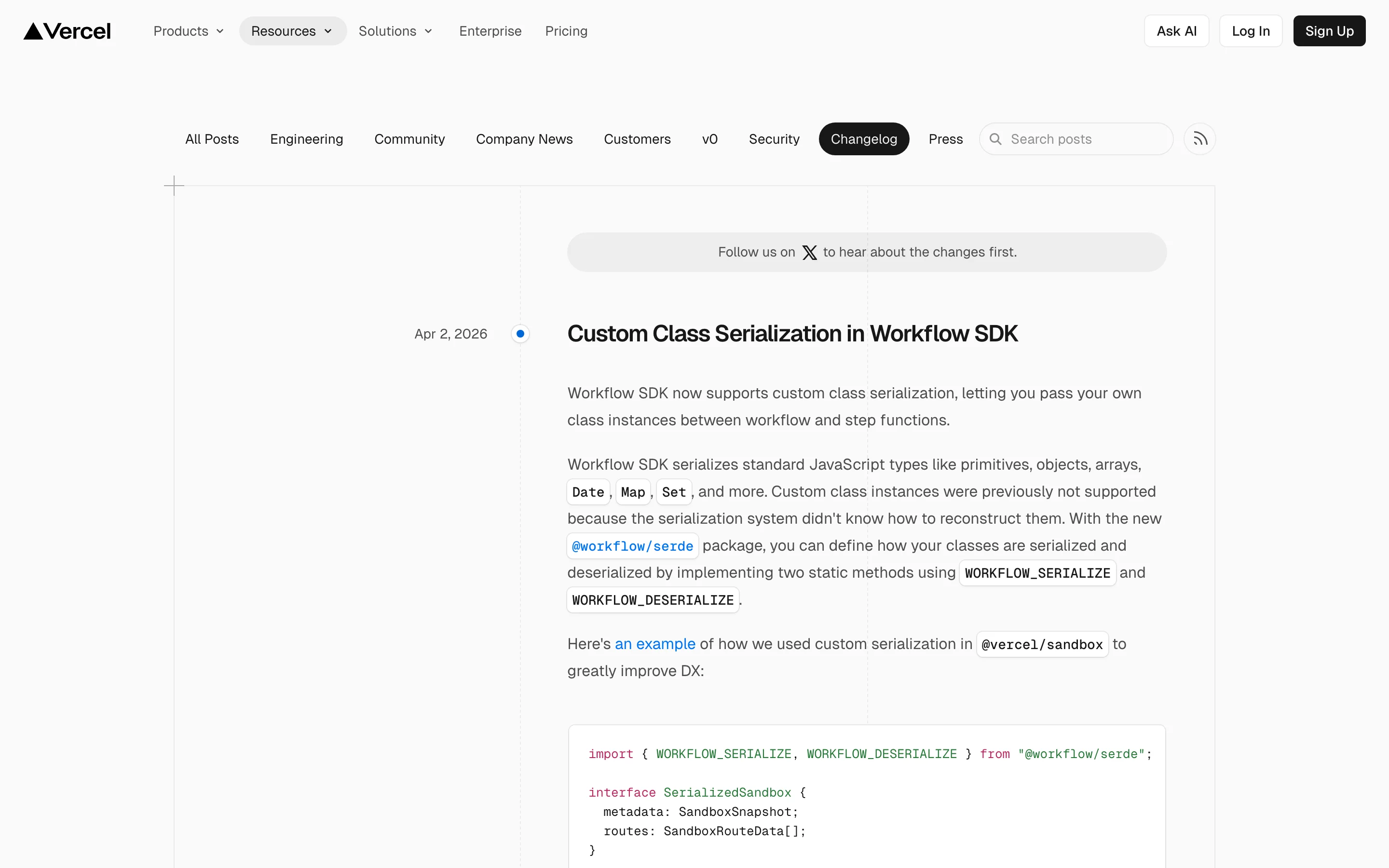
What makes it work is the before/after benchmarks. "Build times reduced from 45s to 12s" communicates value instantly. Developers trust numbers more than adjectives.
Format: Version-based with upgrade guides
Cadence: Per release
Laravel's release notes are a reference for the PHP ecosystem. Each major version gets a dedicated page with a complete list of new features, breaking changes, and an upgrade guide. Code examples accompany every feature. The tone is educational, explaining not just what's new but how to use it.
What makes it work is the upgrade guide. For a framework that thousands of applications depend on, the upgrade path is as important as the features themselves. Laravel never ships a major version without a detailed migration path.
Key takeaway: Developer-focused changelogs succeed or fail on precision. Vague descriptions like "improved performance" damage trust with a technical audience. Include version numbers, affected endpoints, code examples, and migration paths.
These changelogs tell a story. They provide context about why changes were made, not just what changed.
Format: Problem-solution blog posts
Cadence: Per major feature
Intercom publishes detailed product updates that read more like product blog posts. They open with the customer problem ("You told us X was frustrating"), explain the solution, and walk through how to use it. Customer quotes and data justify the change. Annotated screenshots show the feature in context.
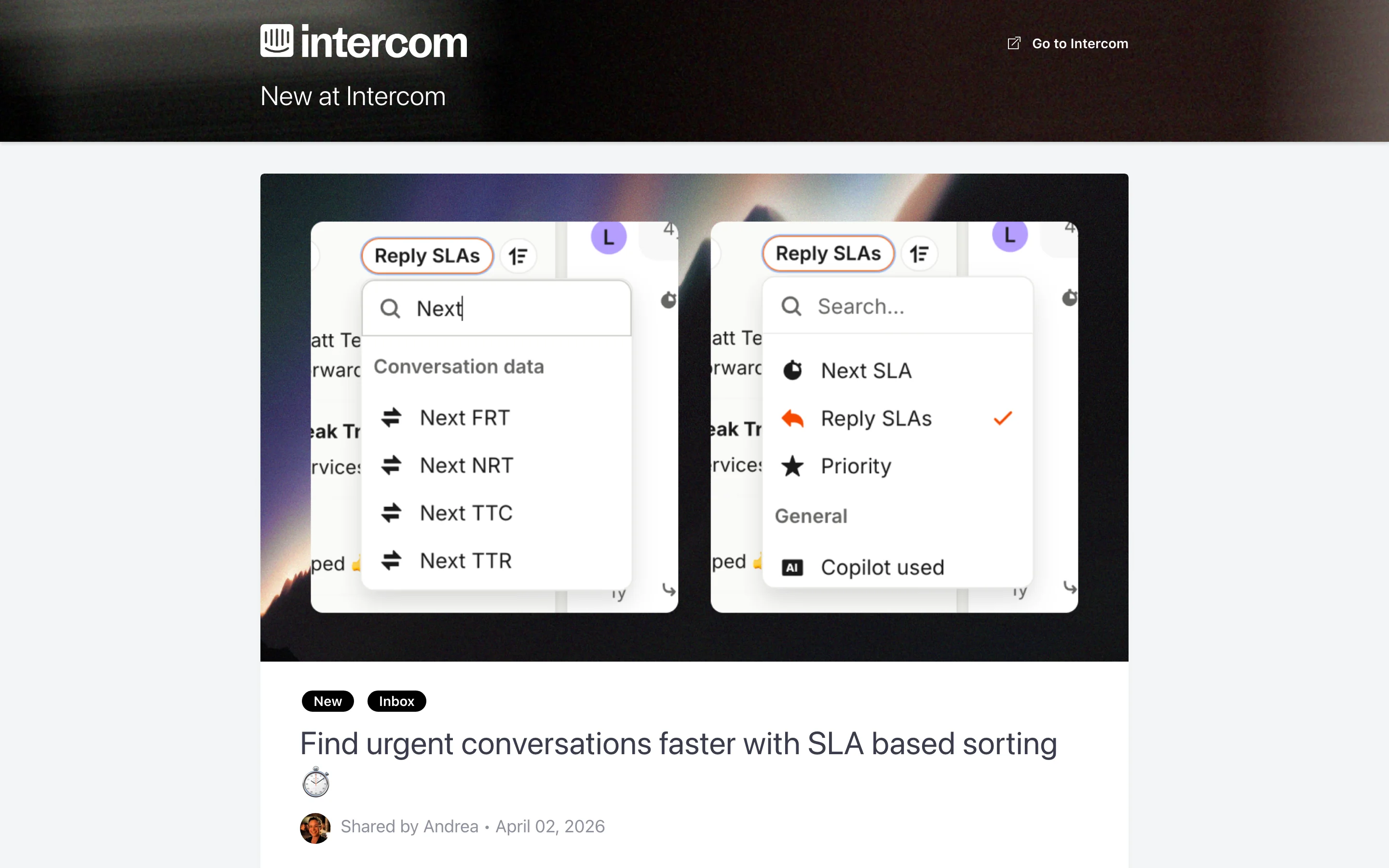
What makes it work is the problem-solution framing. Starting with the customer's pain makes the solution feel like a response to real needs rather than a corporate announcement.
Format: Two-tier system (blog posts for big features, changelog for smaller ones)
Cadence: Continuous with periodic spotlights
Slack writes for a mixed audience spanning non-technical team leads to IT admins. Major features get blog posts with clear language. Enterprise-relevant details (compliance, admin controls) are called out separately so admins can find them quickly.
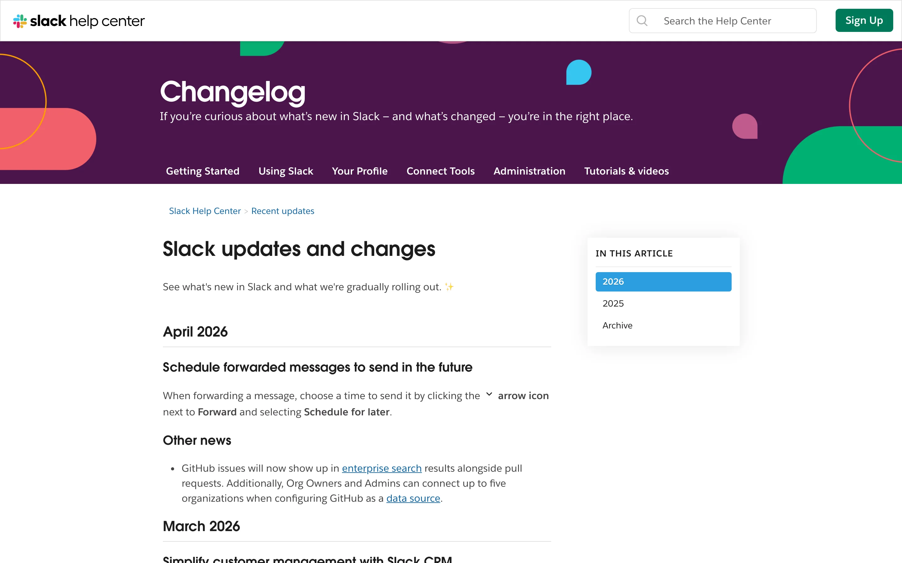
What makes it work is the two-tier approach. Not everything deserves the same treatment. A new emoji pack gets a changelog entry. A redesigned search experience gets a blog post. This hierarchy prevents changelog fatigue.
Format: Seasonal launch pages with detailed walkthroughs
Cadence: Quarterly major releases, ongoing smaller updates
Asana groups its biggest updates into seasonal "What's New" launch pages that feel like mini product events. Each release gets a hero section, product screenshots, and detailed walkthroughs of new capabilities. Smaller updates are woven into the page below the headline features, and webinar registration links let users learn more in real time.
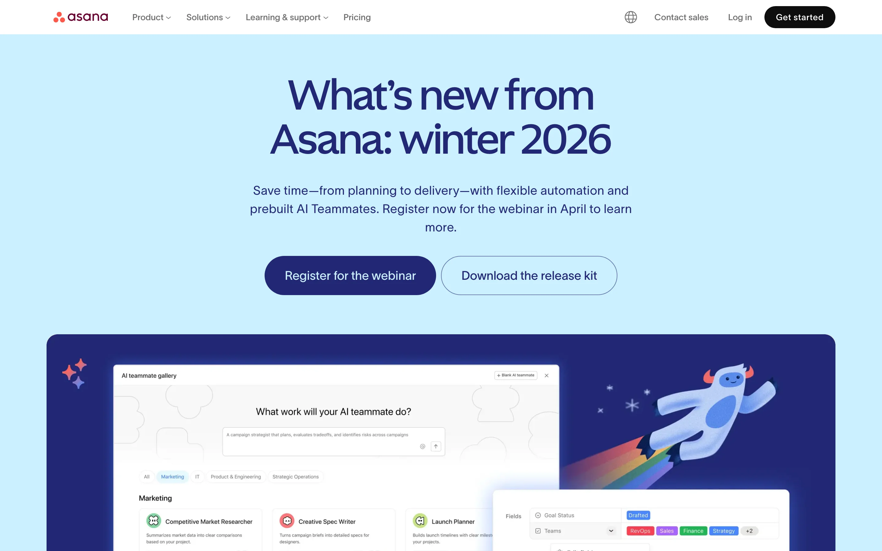
What makes it work is the launch event format. By batching updates into seasonal releases, Asana creates anticipation and gives each cycle a clear narrative arc. Users remember "the winter 2026 release" rather than a stream of disconnected updates.
Key takeaway: Narrative changelogs work when your audience includes non-technical users. Starting with the customer problem, rather than the technical solution, makes updates feel relevant and human.
This pattern links the changelog to the broader product feedback loop, connecting shipped features back to the requests that inspired them.
Format: Feedback-connected entries with release grouping
Cadence: Continuous with grouped releases
ProductLift takes a fundamentally different approach by connecting the changelog directly to the feedback loop. In ProductLift, every changelog entry can trace its origin back to a feedback post. When something ships and moves to the changelog, every user who voted for it gets notified automatically. This closes the loop between "I wish this existed" and "we built it."
The Journey Model is the core concept: a single post travels from feedback to roadmap to changelog to knowledge base, preserving its full history. Across the platform, 6,035 product teams have collected 157,624 feedback items and shipped 39,406 features through this workflow.
Key features that make this effective:
What makes it work is the connection to feedback. When users see their specific request show up in the changelog, they feel heard. That emotional moment turns casual users into advocates.
| Approach | Best For | Format | Notification Strategy | Examples |
|---|---|---|---|---|
| Minimalist | Frequent small updates, developer tools | Timeline with labels | RSS, in-product badge | Linear, Plausible, Tailwind, Resend |
| Visual | UI-heavy products, design tools | Blog-style with rich media | Email, social media | Notion, Figma, Framer |
| Developer-focused | APIs, platforms, frameworks | Version-anchored with code blocks | RSS, webhook, email | Stripe, GitHub, Vercel, Laravel |
| Narrative | Broad audiences, B2B SaaS | Problem-solution blog posts | Email digest, in-product | Intercom, Slack, Asana |
| Connected | Feedback-driven products | Linked to user requests | Automatic voter notification | ProductLift |
Try it yourself: Set up a feedback board and changelog on ProductLift to see the connected approach in action. Every item travels from feedback to roadmap to changelog, with voters notified at each stage. No credit card required.
Pick a pattern that matches your audience. Developer tools need precision and code examples. Consumer products need visuals and plain language. There's no universal format. For detailed templates and before/after rewrites, see our guide on how to write release notes. Look at the examples closest to your audience and borrow their patterns.
Categorize consistently. Whether you use labels, tags, or emoji, make it easy for readers to scan for the type of change they care about. Linear's labels, GitHub's tags, and Stripe's product areas all serve this purpose.
Write headlines that state the benefit. "Faster dashboard" beats "Performance optimization" every time. According to Nielsen Norman Group research, users make stay-or-go decisions in the first 10 seconds of reading. Your headline is that moment.
Use visuals for visual changes. Screenshots and GIFs aren't decoration. They're communication. Notion and Figma prove that a 10-second demo communicates a UI change faster than any paragraph.
Publish on a consistent cadence. Weekly, biweekly, or monthly. Pick one and stick to it. Consistency builds the habit of checking. Intercom's research shows that teams with a regular publishing rhythm see 40% more returning changelog readers.
Connect shipped features to the people who requested them. This is the highest-ROI communication you can do. When users see their feedback turn into features, they stay. ProductLift automates this through the Journey Model, notifying all voters when their request ships.
Make your changelog easy to find. Link to it from your product's navigation, your website footer, and your knowledge base. Add an in-product widget. A great changelog that nobody can find is a wasted effort.
Try it yourself: See how ProductLift combines feedback collection, roadmapping, and changelog publishing in one connected system. Start with the getting started guide. No credit card required.
It depends on your needs. If you just need a static page, a simple blog or markdown file works. If you want categorization, voter notifications, and a connection to your feedback system, a dedicated tool like ProductLift gives you that out of the box. The best platform is the one your team will actually keep updated consistently.
Most successful SaaS changelogs update weekly or biweekly. The frequency matters less than the consistency. If you commit to weekly updates, publish weekly. Irregular, sporadic updates train users to stop checking. Among the 15 examples here, the most engaged audiences belong to companies that publish on a predictable schedule.
No. Include changes that are visible to users or affect their workflow. Internal refactors, minor code cleanup, and infrastructure changes that have no user-facing impact don't belong in a public changelog. Some teams maintain a separate internal changelog for engineering. The best public changelogs, like Linear's and Stripe's, are curated to include only what users need to know.
Three approaches work consistently. First, add an in-product notification widget (like ProductLift's "What's New" popup) so active users see updates. Second, send a periodic email digest to your user base. Third, share major features on social media with visuals. The companies with the most-read changelogs, such as Notion and Figma, use all three channels simultaneously.
Yes. A regularly updated changelog page signals to search engines that your site is active. Each entry can rank for long-tail keywords related to the features you're announcing. Vercel and GitHub both get meaningful organic traffic from their changelog pages. The key is writing headlines that include the terms your users actually search for.
Public, in almost all cases. A public changelog serves as a trust signal for potential customers (they can see the product is actively developed), helps with SEO, and gives existing users a single place to check for updates. The only exception is if your product serves a market where feature secrecy is a competitive concern. Every company in this list maintains a public changelog.
Join over 5,204 product managers and see how easy it is to build products people love.
Did you know 80% of software features are rarely or never used? That's a lot of wasted effort.
SaaS software companies spend billions on unused features. In 2025, it was $29.5 billion.
We saw this problem and decided to do something about it. Product teams needed a better way to decide what to build.
That's why we created ProductLift - to put all feedback in one place, helping teams easily see what features matter most.
In the last five years, we've helped over 5,204 product teams (like yours) double feature adoption and halve the costs. I'd love for you to give it a try.

Founder & Digital Consultant
Learn how to write release notes people actually read. Covers structure, formatting, audience targeting, distribution, and templates.
Understand the difference between a changelog and release notes. Compare format, audience, frequency, and learn when to use each for your SaaS product.
Learn when and how to make your product roadmap public. Covers formats (Now/Next/Later, timeline, kanban), what to show vs hide, and managing expectations.
Most feedback loops break after collection. Learn the 5 stages of a closed feedback loop and how to notify customers automatically.
Learn every feedback collection channel, how to organize responses, and how to build a program that drives product decisions. Practical SaaS guide.
With bike energy  from Utrecht
Ruby Foundry B.V. - KVK: 99995662 - BTW: NL869219789B01