The best way to build a great knowledge base is to study what's already working. Instead of guessing at structure, formatting, and design, you can look at companies who've invested millions in their documentation and borrow what makes sense for your product.
This guide breaks down 10 SaaS knowledge base examples, explains what each one does well, and gives you a specific takeaway you can apply to your own documentation. At the end, we'll cover the common patterns across all of them and how to build your own knowledge base using those principles.
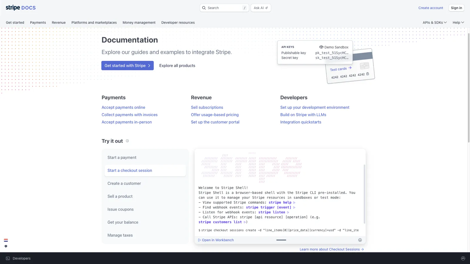
Stripe's documentation is widely considered the gold standard for developer-facing knowledge bases. It combines conceptual explanations with interactive code examples in a way that lets developers learn and build simultaneously.
What makes it great:
Takeaway you can apply: Structure your articles for progressive disclosure. Start with the simplest explanation and link to detailed articles for readers who need more depth. Don't front-load complexity.
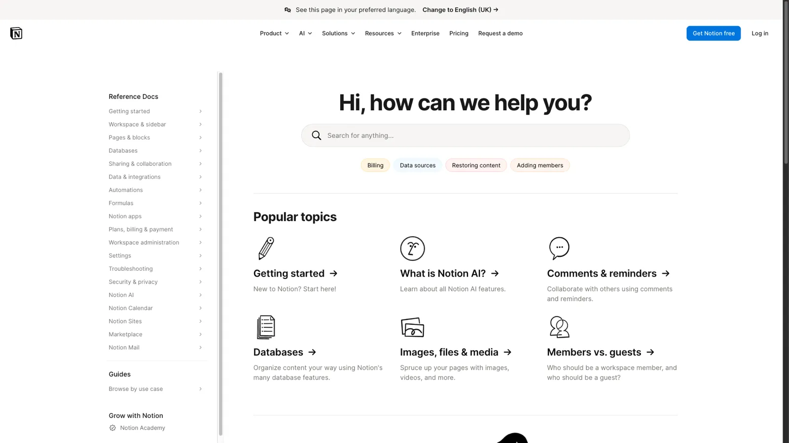
Notion's help center reflects the product's design philosophy. It is clean, minimal, and well-organized. For a product as feature-rich as Notion, the help center manages to feel approachable rather than overwhelming.
What makes it great:
Takeaway you can apply: Use GIFs instead of static screenshots for multi-step processes. A 5-second GIF showing a drag-and-drop interaction communicates more than three annotated screenshots.
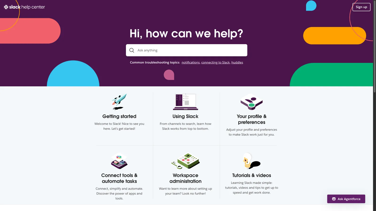
Slack serves millions of users with wildly different technical proficiency levels. This ranges from developers managing workspace integrations to administrative assistants who just need to find a channel. Their help center handles this range effectively.
What makes it great:
Takeaway you can apply: If your product works across platforms (web, mobile, desktop), use tabs or toggles to show platform-specific instructions within the same article. This avoids creating separate articles per platform.
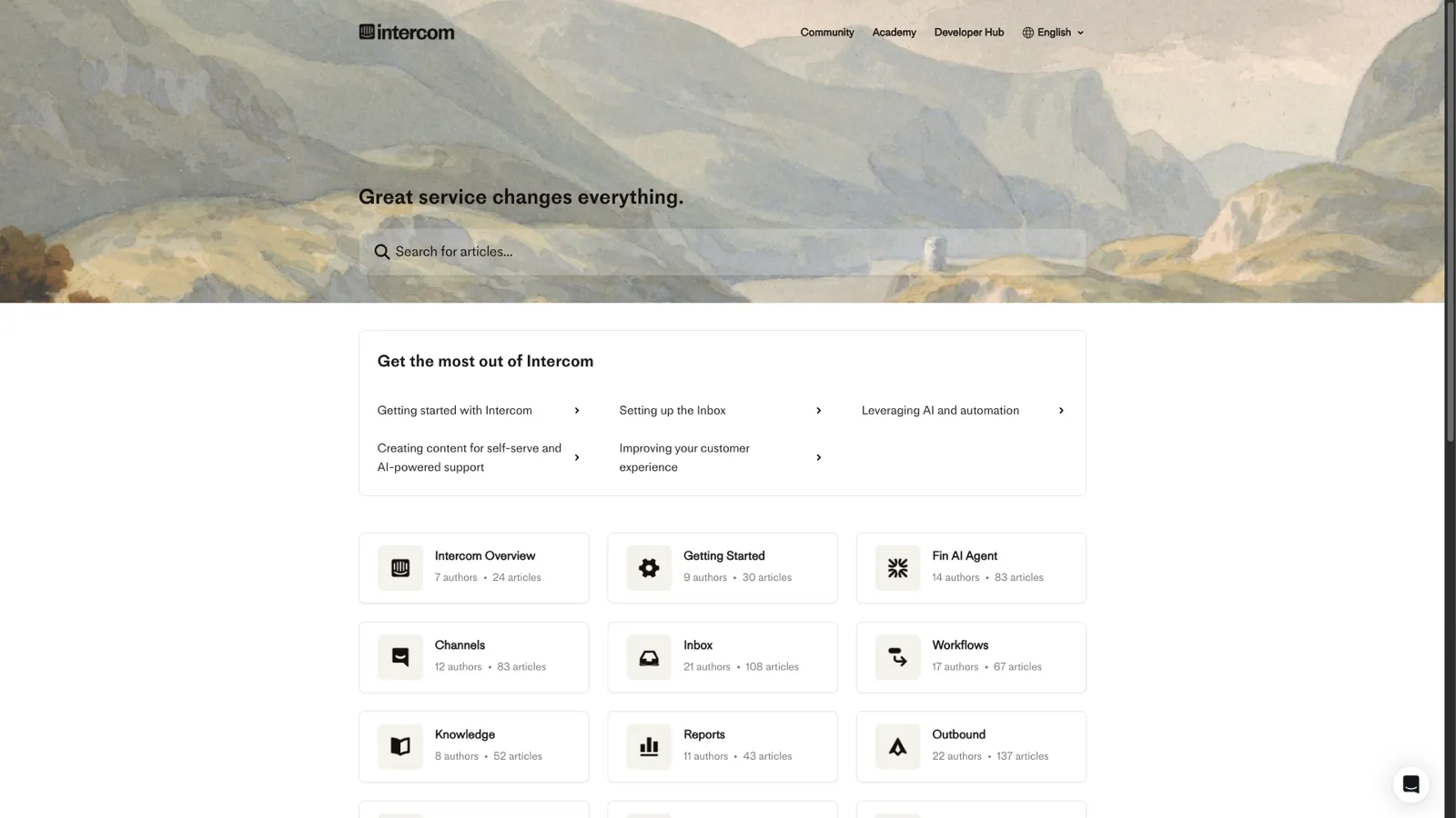
Intercom practices what they preach. Their help center is powered by their own Articles product. It demonstrates what contextual, integrated help documentation looks like when done well.
What makes it great:
Takeaway you can apply: Make your knowledge base accessible from inside your product, not just from a separate website. Contextual help that shows the right article at the right moment is dramatically more effective than a standalone help site.
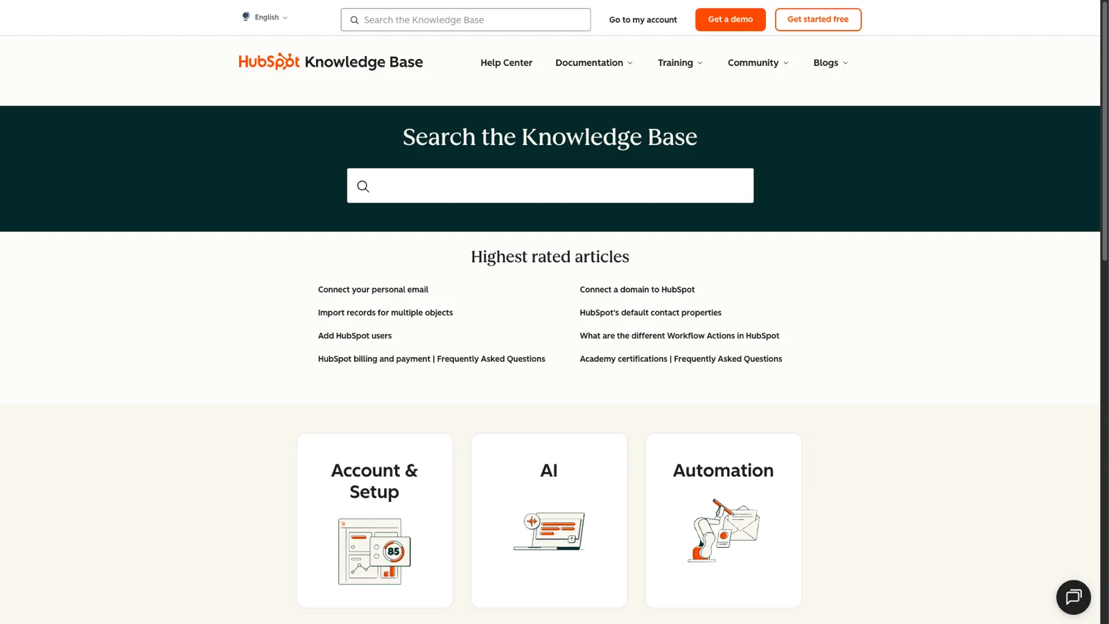
HubSpot's knowledge base covers an enormous product surface area. It spans CRM, marketing, sales, service, and CMS tools. It manages to stay organized through disciplined categorization and a powerful search experience.
What makes it great:
Takeaway you can apply: If your product has multiple pricing tiers, indicate which tier each feature belongs to within your knowledge base articles. This prevents the frustration of following instructions for a feature you don't have access to.
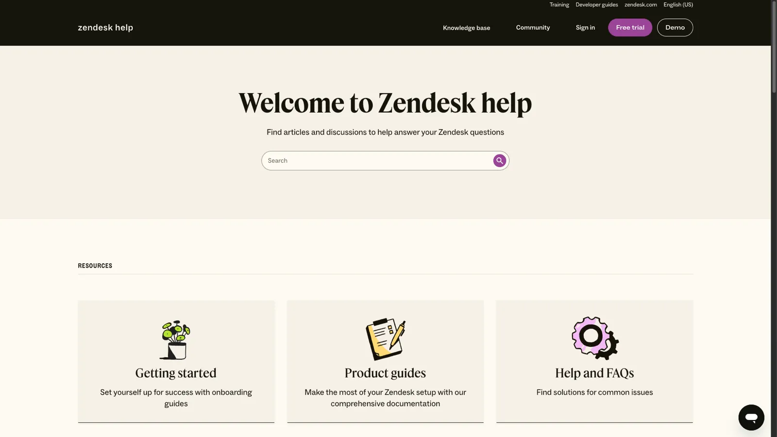
Zendesk's help center is built on their own Guide product and serves as both a showcase and a reference implementation. As one of the largest customer support platforms, their documentation needs to serve everyone from solo founders to enterprise support teams.
What makes it great:
Takeaway you can apply: Use reusable content blocks for instructions that appear in multiple articles (like "how to access admin settings"). When the process changes, you update it once instead of hunting through every article that references it.
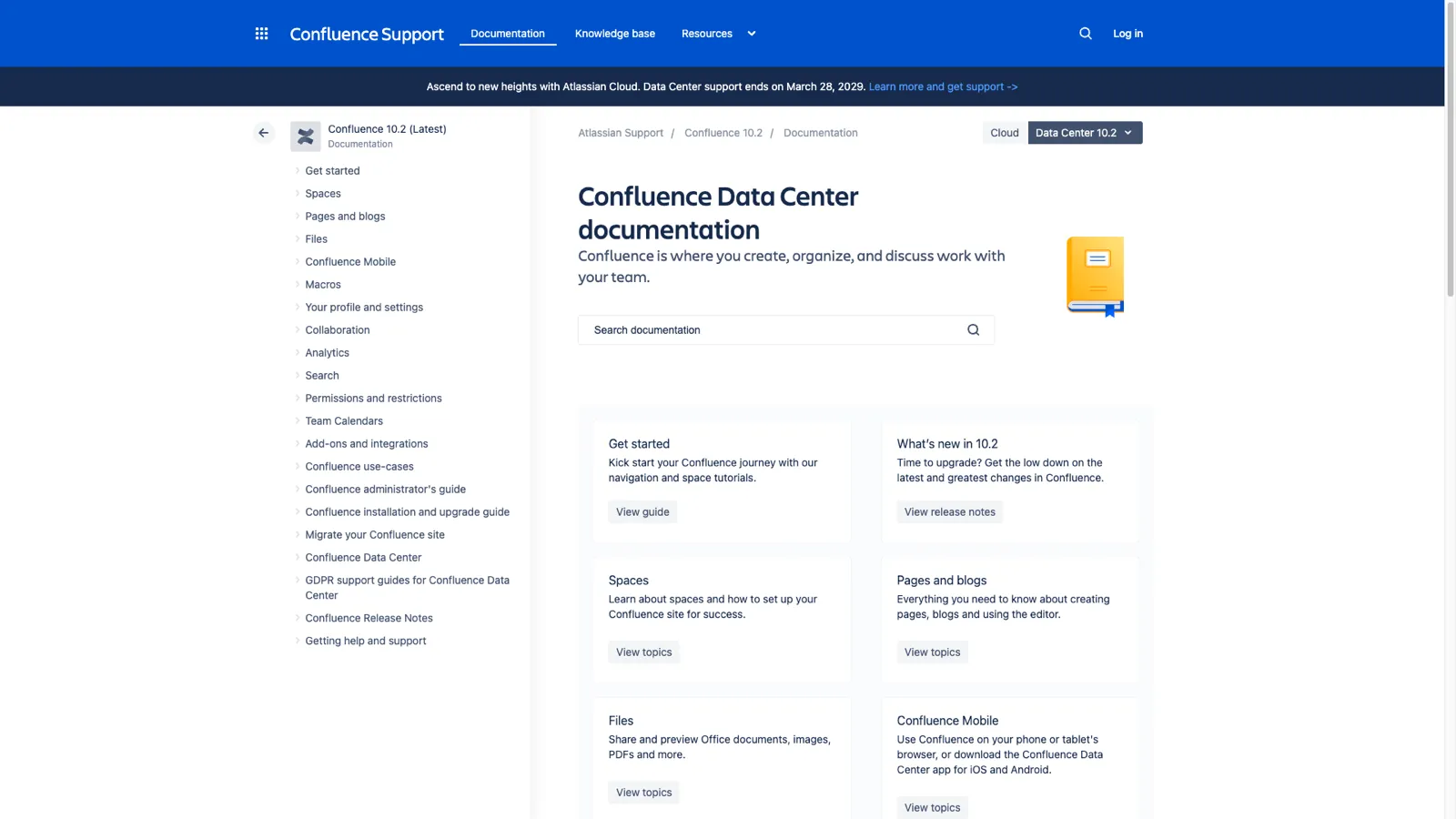
Atlassian's documentation covers a massive ecosystem: Jira, Confluence, Bitbucket, Trello, and more. Their wiki-style approach uses their own product's strengths and demonstrates how collaborative documentation works at scale.
What makes it great:
Takeaway you can apply: Link aggressively between related articles. Every time you mention a feature or concept documented elsewhere, make it a link. This helps users discover features they didn't know existed and improves your knowledge base's SEO through internal linking.
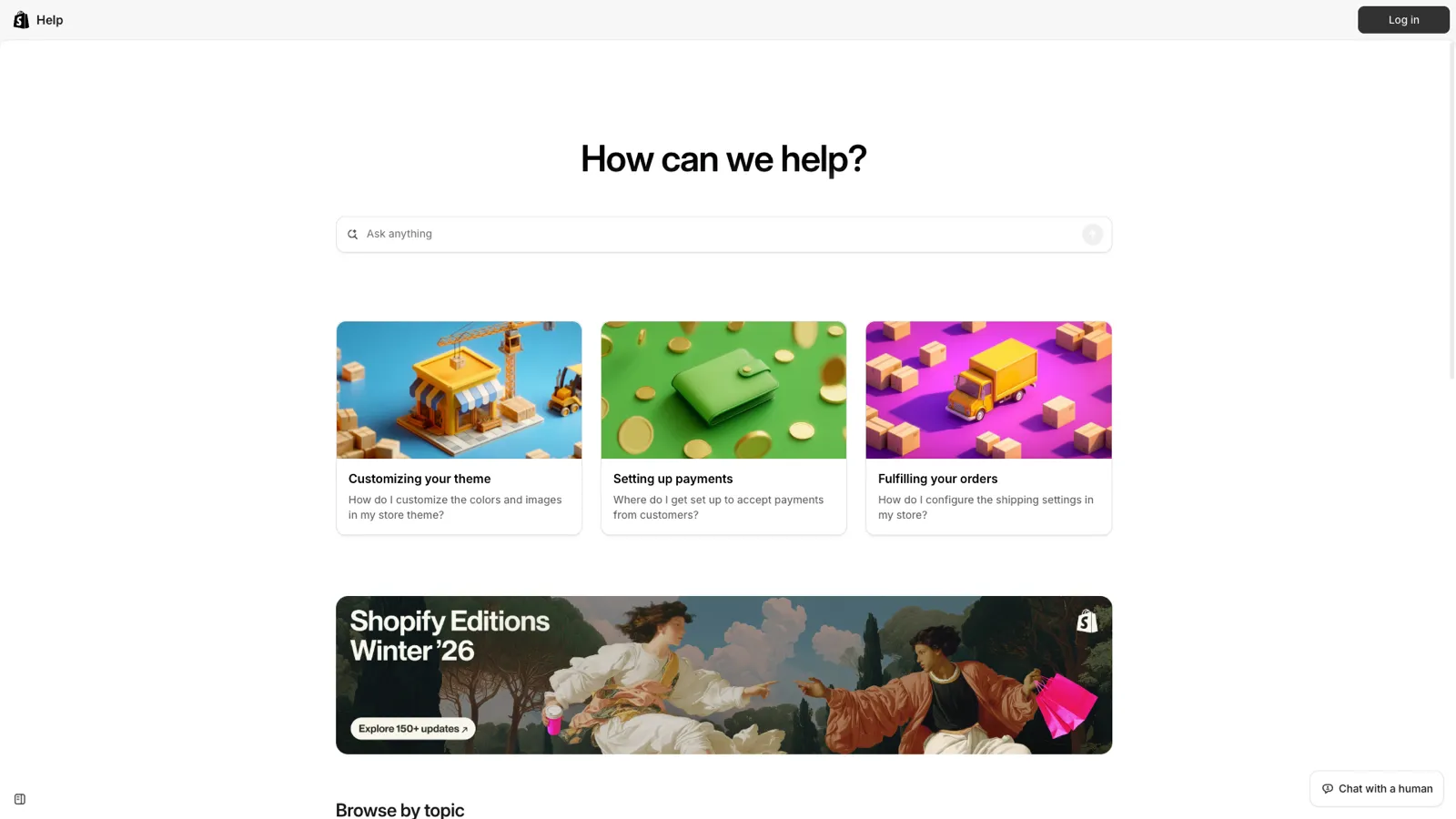
Shopify's audience is predominantly non-technical. It includes small business owners, creators, and entrepreneurs who may have never configured software before. Their help center reflects this by prioritizing clarity over volume.
What makes it great:
Takeaway you can apply: Write article titles as tasks, not topics. "How to Set Up Email Notifications" is more useful than "Email Notification Settings" because it matches how users think about their problem.
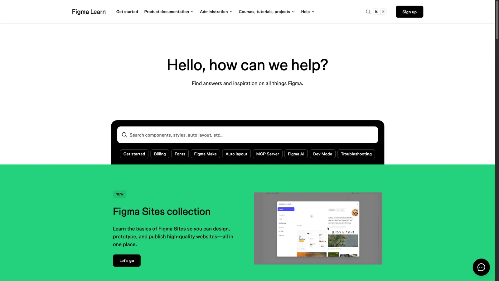
Figma's help center is designed for designers. These are people who are visually oriented and expect a high-quality aesthetic experience. The documentation itself serves as evidence that Figma understands its users.
What makes it great:
Takeaway you can apply: Know your audience's communication preference and design your articles for that medium. For visual products, lead with images. For developer tools, lead with code. For business tools, lead with outcomes.
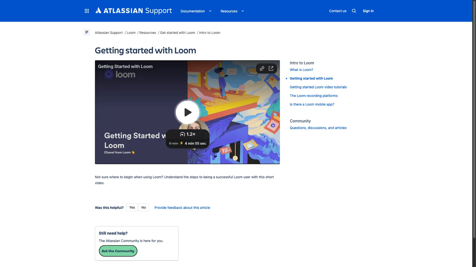
Loom's knowledge base is notable for practicing what the product preaches. As a video messaging tool, their documentation makes heavy use of video to explain concepts.
What makes it great:
Takeaway you can apply: If your product lends itself to screen recordings, record a short walkthrough for every knowledge base article. Having both video and text accommodates different learning styles and makes complex workflows much clearer.
Across all 10 examples, several patterns emerge consistently. These are the non-negotiable elements of an effective knowledge base:
Every example invests heavily in search. They offer instant results, typo tolerance, synonym matching, and prominent placement. Search is the primary way users navigate a knowledge base. If it doesn't work well, nothing else matters.
None of these knowledge bases present articles as a flat list. They all use hierarchical categories that match how users think about the product. The specific structure varies (by feature, by role, by task), but the principle is constant: help users browse when they can't search.
Every example includes screenshots, GIFs, or video for key processes. Text-only documentation has lower comprehension and higher bounce rates. Visuals are especially critical for UI-heavy products where "click the gear icon in the top right" could mean several things without a supporting image.
All 10 include some form of article-level feedback. This includes "Was this helpful?" widgets, emoji reactions, or links to submit questions. This feedback data drives continuous improvement. Without it, you're flying blind.
These knowledge bases stay current because the companies behind them treat documentation as part of the product development process, not as an afterthought. When a feature ships, the documentation ships with it. Outdated help articles erode trust and increase support tickets.
Every article within each knowledge base follows the same structure. Readers learn the format once and can navigate any article efficiently. This consistency comes from templates and style guides that every writer follows.
You don't need Stripe's engineering team or HubSpot's content budget to build an effective knowledge base. You need:
The biggest challenge isn't the initial build. It's keeping the knowledge base current as your product evolves. This is where most knowledge bases fail. The team ships a new feature, updates the changelog, and forgets to update the help docs. Three months later, half the knowledge base is outdated.
ProductLift solves this by connecting your knowledge base to your product development workflow. When you ship a feature and write a changelog entry, AI can auto-generate a knowledge base article draft from it. You review, edit, and publish. Documentation stays in sync with your product without requiring a separate content process.
ProductLift's knowledge base includes:
If you want to see how these knowledge base principles look in practice, check out our detailed comparison of the best knowledge base software for SaaS.
A good knowledge base has clear categorization, powerful search, visual documentation, and consistent article formatting. The examples above all share these traits. The most important factor is keeping content accurate and up to date.
The biggest mistakes are letting content go stale, organizing articles by internal team structure instead of user needs, writing long paragraphs without visuals, and not tracking search analytics to find content gaps.
Most SaaS companies target a self-service rate of 70-80%. This means 7-8 out of 10 users find their answer without contacting support. Start by measuring your current rate, then improve it by adding articles for your most common support topics.
Intercom and Zendesk use their own products. Others use custom-built solutions or platforms like Contentful. For most SaaS companies, a dedicated tool like ProductLift, Zendesk Guide, or Intercom Articles provides everything you need without custom development.
Export your 20 most common support tickets, write articles for the top 10, organize them into 3-5 categories, and add screenshots. Launch with this starter set and expand based on search analytics and customer feedback.
You can see results with as few as 10-20 well-written articles covering your most common support topics. Quality matters more than quantity. One clear, accurate article deflects more tickets than ten outdated ones.
The best knowledge base is not the biggest. It's the one that answers the questions your customers actually ask. Start small, measure what works, and expand based on data.
Pick any three takeaways from the examples above and apply them to your first 10 articles. That alone will put you ahead of most SaaS companies whose knowledge base is either nonexistent, outdated, or impossible to navigate.
Start your free trial of ProductLift to build a knowledge base that stays connected to your product feedback, roadmap, and changelog. Starting at $19/month with unlimited end-users.
Join over 3,051 product managers and see how easy it is to build products people love.
Did you know 80% of software features are rarely or never used? That's a lot of wasted effort.
SaaS software companies spend billions on unused features. In 2025, it was $29.5 billion.
We saw this problem and decided to do something about it. Product teams needed a better way to decide what to build.
That's why we created ProductLift - to put all feedback in one place, helping teams easily see what features matter most.
In the last five years, we've helped over 3,051 product teams (like yours) double feature adoption and halve the costs. I'd love for you to give it a try.

Founder & Digital Consultant
Discover 12 proven knowledge base best practices for SaaS. Learn how to structure, write, and maintain help articles that reduce support tickets.
Learn how to create a knowledge base from scratch. This guide covers planning, writing, structuring, and maintaining help docs that reduce support tickets.
Learn the key differences between a knowledge base and FAQ page. See when to use each, how they compare on structure and depth, and how to combine both.
See how real product teams use RICE, ICE, MoSCoW, and other prioritization frameworks. 6 practical examples with actual scores, decisions, and outcomes.
A practical decision guide for choosing the right product prioritization framework. Answer 4 questions to find the best framework for your team size, data, and decision type.
With bike energy  from Utrecht
KVK: 20145923 - BTW: NL001143413B86