Looking for a RICE PPT template? We've created a PowerPoint presentation for RICE prioritization that you can download and customize. Whether you need to present feature priorities at a sprint planning session or justify your roadmap to leadership, this template gives you a professional starting point.
👉 Download RICE Prioritization Template
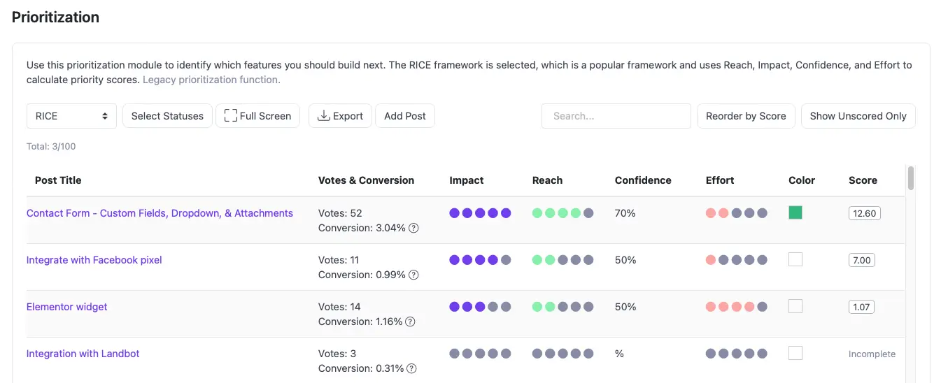
RICE is a prioritization framework that stands for Reach, Impact, Confidence, and Effort. Product teams use it to score and rank feature requests, bug fixes, and initiatives so the highest value work rises to the top. You can calculate your own scores with our RICE Calculator.
For a more detailed explanation, check out: Understanding RICE Prioritization
A RICE scoring spreadsheet is useful on its own, but a well structured presentation turns raw numbers into a persuasive story. Here are the situations where a RICE PowerPoint deck adds the most value:
Our PowerPoint RICE prioritization template is designed to help you:
Prefer a different format? Excel version | Google Sheets version | All RICE templates
A strong RICE presentation follows a logical arc. Here is what each slide should contain:
State the meeting purpose, the date, and the time period the scores cover. Example: "Q3 Feature Prioritization: RICE Results." Keep it clean and include your company logo.
Briefly define the four RICE components so everyone in the room shares the same understanding:
If your audience already knows how RICE works, you can skip this slide or leave it as an appendix.
Show the specific scales your team agreed on. For example, define what a "3" means for Impact versus a "1." This slide prevents debates about methodology during the review itself.
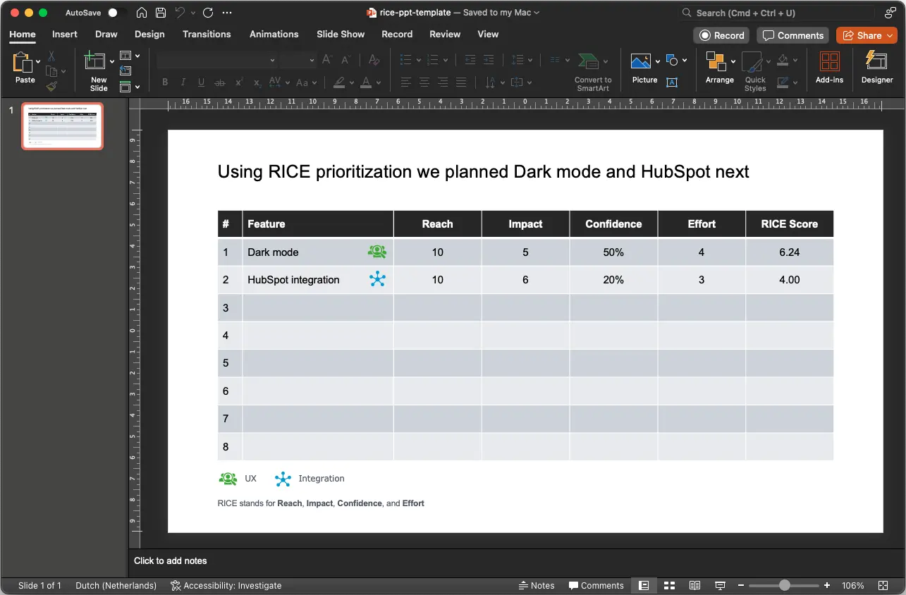
This is the core of the deck. Display a table with columns for Feature Name, Reach, Impact, Confidence, Effort, and the final RICE Score. Sort from highest to lowest. Use conditional formatting or color coding so the top items stand out immediately.
A horizontal bar chart or bubble chart makes the ranking intuitive at a glance. Plot features on one axis and RICE scores on the other. Stakeholders who skim the deck will absorb this slide fastest.
For the three highest scoring features, add a slide each (or combine them) with a short description, the score breakdown, and any relevant customer quotes or data points.
Address the features that scored low. This shows that the process is rigorous and prevents questions like "but what about Feature X?" later.
Close with clear actions: which features move into the next sprint, which need further research (low confidence), and which are deprioritized. Include owners and timelines if available.
Not everyone in the room will be familiar with prioritization frameworks. These tips help you communicate RICE scores clearly:
The same RICE data can be presented in very different ways depending on who is in the room.
For engineering teams: Focus on effort estimates and confidence levels. Engineers want to know how realistic the scope is and whether the team has enough information to start building. Include technical details and link to specs where available.
For executives and board members: Emphasize reach and impact. Strip out implementation complexity and instead highlight revenue potential, user growth, and strategic alignment. Use larger fonts, fewer slides, and more charts.
For customer success teams: Highlight which features address the most common customer complaints or requests. Include customer quotes or ticket counts alongside the RICE scores. This audience cares about reach in terms of support volume reduction and satisfaction improvement.
For external stakeholders or customers: If you share a version of your roadmap publicly, simplify the RICE output into a "what's coming next" narrative. You do not need to expose raw scores. Instead, frame the top items as "most requested" or "highest impact."
Let's walk through how a fictional SaaS team might present their RICE results. They have scored five feature requests using the RICE framework:
| Feature | Reach | Impact | Confidence | Effort | RICE Score |
|---|---|---|---|---|---|
| Slack integration | 3,000 users/qtr | 2 | 90% | 3 person months | 1,800 |
| Dark mode | 5,000 users/qtr | 1 | 80% | 4 person months | 1,000 |
| Advanced reporting | 1,200 users/qtr | 3 | 70% | 5 person months | 504 |
| Bulk CSV export | 800 users/qtr | 2 | 95% | 1 person month | 1,520 |
| Custom branding | 400 users/qtr | 2 | 60% | 6 person months | 80 |
Here is how the product manager would present these results:
"Our top priority is Slack integration." It reaches 3,000 users per quarter with a high confidence score of 90%. The effort is moderate at three person months, but the combination of reach and impact makes this the clear winner.
"Bulk CSV export is our quick win." Despite lower reach, the effort is just one person month and confidence is 95%. This is a strong candidate for the current sprint because it delivers value fast.
"Dark mode has high reach but lower impact." It scores well overall but sits behind the top two. We recommend scheduling it for next quarter.
"Advanced reporting needs more research." The impact is high but confidence is only 70%. Before committing five person months, the team should run user interviews to validate demand. This drops to the backlog with a research task attached.
"Custom branding is deprioritized." Low reach, low confidence, and high effort produce the lowest score. Unless new data emerges, this stays off the roadmap.
This kind of narrative turns a table of numbers into a clear, actionable recommendation that any stakeholder can follow.
While PowerPoint is great for presentations, it might not be the best tool for managing ongoing prioritization. For a more dynamic and collaborative approach, consider using ProductLift's prioritization feature. With ProductLift, you can:
To calculate the scores to enter in the PPT file, try this online RICE Calculator tool: RICE Calculator
Whether you choose Excel, Google Sheets, PowerPoint, Notion, or Miro, our RICE templates are here to help you make informed, objective decisions about your product features. And if you're looking for a solution that grows with your team and product, ProductLift offers the tools you need for long term success.
Join over 5,204 product managers and see how easy it is to build products people love.
Did you know 80% of software features are rarely or never used? That's a lot of wasted effort.
SaaS software companies spend billions on unused features. In 2025, it was $29.5 billion.
We saw this problem and decided to do something about it. Product teams needed a better way to decide what to build.
That's why we created ProductLift - to put all feedback in one place, helping teams easily see what features matter most.
In the last five years, we've helped over 5,204 product teams (like yours) double feature adoption and halve the costs. I'd love for you to give it a try.

Founder & Digital Consultant
See how real product teams use RICE, ICE, MoSCoW, and other prioritization frameworks. 6 practical examples with actual scores, decisions, and outcomes.
A practical guide for choosing the right prioritization framework. Answer 4 questions to find the best fit for your team size, data, and decisions.
Compare 10 prioritization frameworks side by side. RICE, ICE, MoSCoW, Kano, and more scored on complexity, data needs, and best use cases.
The best prioritization frameworks for startups at every stage. From pre-PMF to growth, learn which framework fits your team size, data, and speed requirements.
Learn when to promote feature requests to your roadmap, how to merge duplicates, notify voters, and keep credibility through the full lifecycle.
With bike energy  from Utrecht
Ruby Foundry B.V. - KVK: 99995662 - BTW: NL869219789B01